CSS特效你知道多少?分享用css画三角形的案例
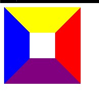
效果图

如何用css画三角形?
1).利用css控制border的边框属性, 画出四个小三角形
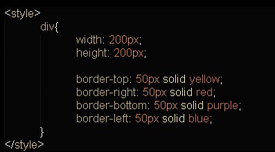
html代码

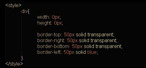
css代码
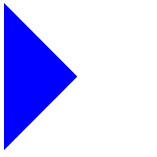
效果:
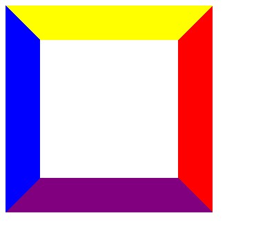
从css很容易看出来, div的边框 border-top, border-right, border-bottom, border-left (上右下左)这三个边框, 都是梯形.
那么, 如果梯形的上底无限接近0的时候, 是不是就越来越接近三角形?
如下:
当width = 200px, height = 200px 的时候,(width为中间白色矩形的宽, height为它的高)

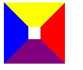
当width = 150px, height = 150px 的时候,
当width = 100px, height = 100px 的时候,
当width = 50px, height = 50px 的时候,
当width = 25px, height = 25px 的时候,
当width = 5px, height = 5px 的时候,
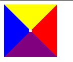
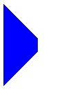
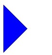
最后, 当width = 0px, height = 0px 的时候,
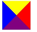
2). 将不需要的三角形透明化
border-color有一取值: transparent (透明), 所以只需要把其他的三角形的border-color设置成 "transparent"就可以了.
html代码
css代码
效果:
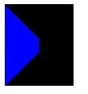
注意:Internet Explorer 6(以及更早的版本)不支持属性值 "transparent"。
在IE6中的效果:
将css改成:
border-color:transparent transparent transparent blue;
border-width:50px;
border-style:dashed dashed dashed solid;
在IE6中的效果:
听了hinong兄弟的话, 加了 "overflow:hidden;", 在IE6显示就正常了.
效果:
演示代码:


 1 <!DOCTYPE html PUBLIC "-//W3C//DTD XHTML 1.0 Strict//EN" "http://www.w3.org/TR/xhtml1/DTD/xhtml1-strict.dtd">
 2 <html xmlns="http://www.w3.org/1999/xhtml" lang="zh-CN">
 3 <head>
 4 <title>new</title>
 5 <meta http-equiv="Content-Type" content="text/html; charset=utf-8" />
 6 <meta name="description" content="Akira.Juggling" />
 7
 8 <style>
 9     div{
10         width: 0px;
11         height: 0px;
12
13         border-top: 50px solid transparent;
14         border-right: 50px solid transparent;
15         border-bottom: 50px solid transparent;
16         border-left: 50px solid blue;
17     }
18 </style>
19
20 </head>
21     <body>
22         <div></div>
23     </body>
24 </html>
本文来源 我爱IT技术网 http://www.52ij.com/jishu/5486.html 转载请保留链接。
- 评论列表(网友评论仅供网友表达个人看法,并不表明本站同意其观点或证实其描述)
-